

Dollar Demise and Silver Surge: A Perfect Storm for Precious Metals.

Tonight, I would like to mostly focus on the US dollar and silver as they’re trading at critical inflection points, more so with silver. Most of the time, there is an inverse correlation between the US dollar and the PM complex, but it’s not 100% of the time. When they are trading inversely to each other, that is when you get your best moves – dollar down, PM complex up, and vice versa.
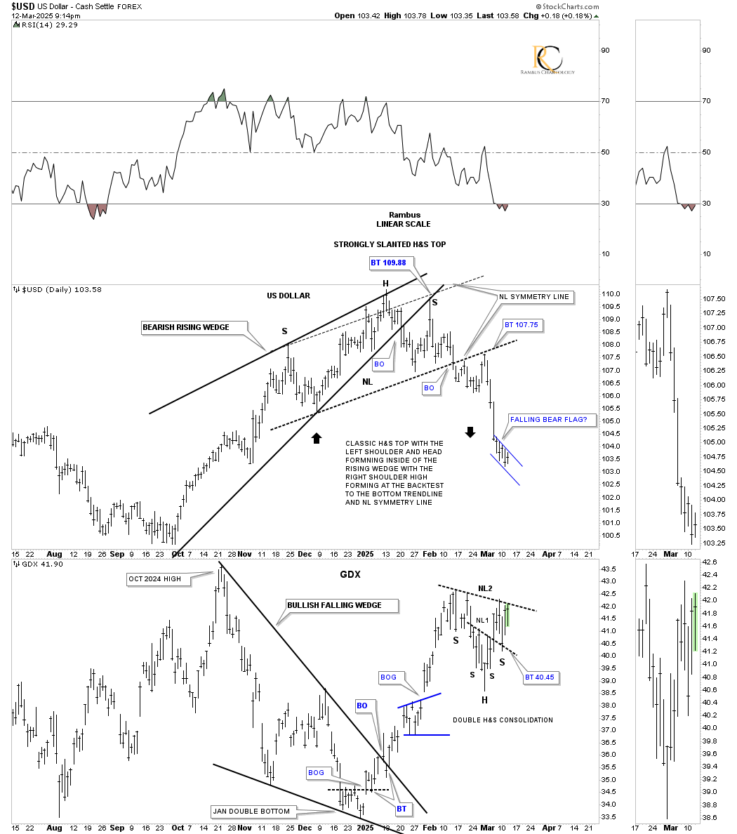
As you can see on this short-term daily chart, which has the US dollar on top with the GDX below, the US dollar bottomed in early October 2024, but the GDX didn’t top out until late October 2024, so the positive correlation was off by several weeks.
They then both formed their inverse wedge patterns, with the US dollar forming a rising wedge while the GDX formed a falling wedge, with both completing their respective breakouts at about the same time. The US dollar on the top chart was more labored in its breakout decline vs. the GDX, which was pretty vertical.
The laborious breakout on the US dollar ended up forming a classic head-and-shoulders (H&S) top, with the left shoulder and head forming inside the rising wedge, while the right shoulder high formed on the backtest to the bottom trendline, where the neckline symmetry intersected at 109.88, completing a strongly slanted H&S top. Since breaking out and backtesting the neckline, the US dollar has been dropping in a near-vertical move and could be forming a small bearish falling flag as a halfway pattern to the downside. You can also see how the price action is reversing symmetry to the downside over the same area on the way up, as shown by the black arrows.
Last week, you may recall the H&S consolidation pattern that was forming on the GDX, which was the smaller NL1 bottom. After the breakout, the GDX backtested the neckline on Monday, which created the right shoulder low for the second H&S bottom, which is now testing NL2 once again. So, the stage is set to see the US dollar drop lower, which will propel the GDX/PM stocks higher.
Next is the weekly combo chart, which has the USDU on top, providing a more balanced approach to the US dollar, with the US dollar on the bottom. These two generally move together, but sometimes the USDU can be stronger than the US dollar, and vice versa. At the 2021 low, they both formed an inverse head-and-shoulders (H&S) bottom, which led to a strong impulse move up for both. However, as you can see on the bottom chart, the US dollar was much stronger going into its 2022 high, rallying in a near-vertical move.
After each reached their 2022 high, they both declined, but the US dollar’s decline was much stronger than the USDU. Once they bottomed, both began to rally once again, but this time the USDU was much stronger than the US dollar, trading above its 2022 high, while the US dollar never came close to its 2022 high, showing a major divergence.
Since topping out in January of this year, the USDU on top is just now starting to decline, while the US dollar formed that H&S top on the daily chart above and is now reversing symmetry to the downside. Also, notice the expanding rising wedge the US dollar has been forming, which is just the opposite of a bullish expanding falling wedge, a chart pattern we know can be very bullish. The expanding rising wedge, a very bearish chart pattern, should lead to a strong decline for the US dollar once the bottom rail gives way.
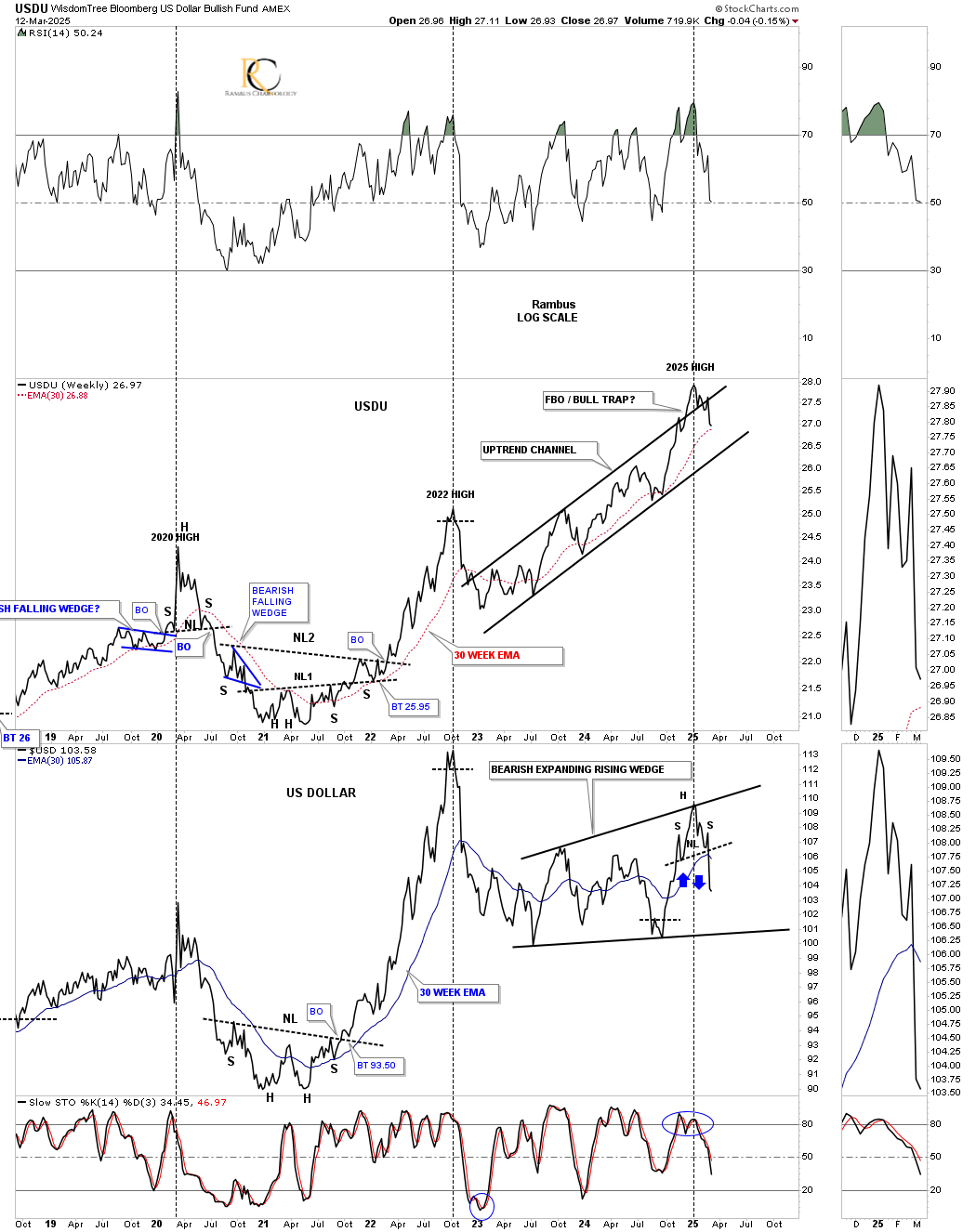
It’s been a while since we last looked at this long-term weekly chart for the UUP, which shows its bull market parallel uptrend channel. The price action had broken out above the top trendline, which could have led to a doubling of the channel if the US dollar was in a bullish mode. Last week, when the UUP traded back inside the rising uptrend channel, that negated the breakout above the top trendline, which we can now label as a false breakout/bull trap. When this type of event happens, you can expect a strong move in the opposite direction, and in this case, down.
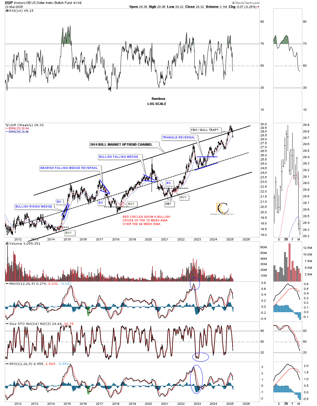
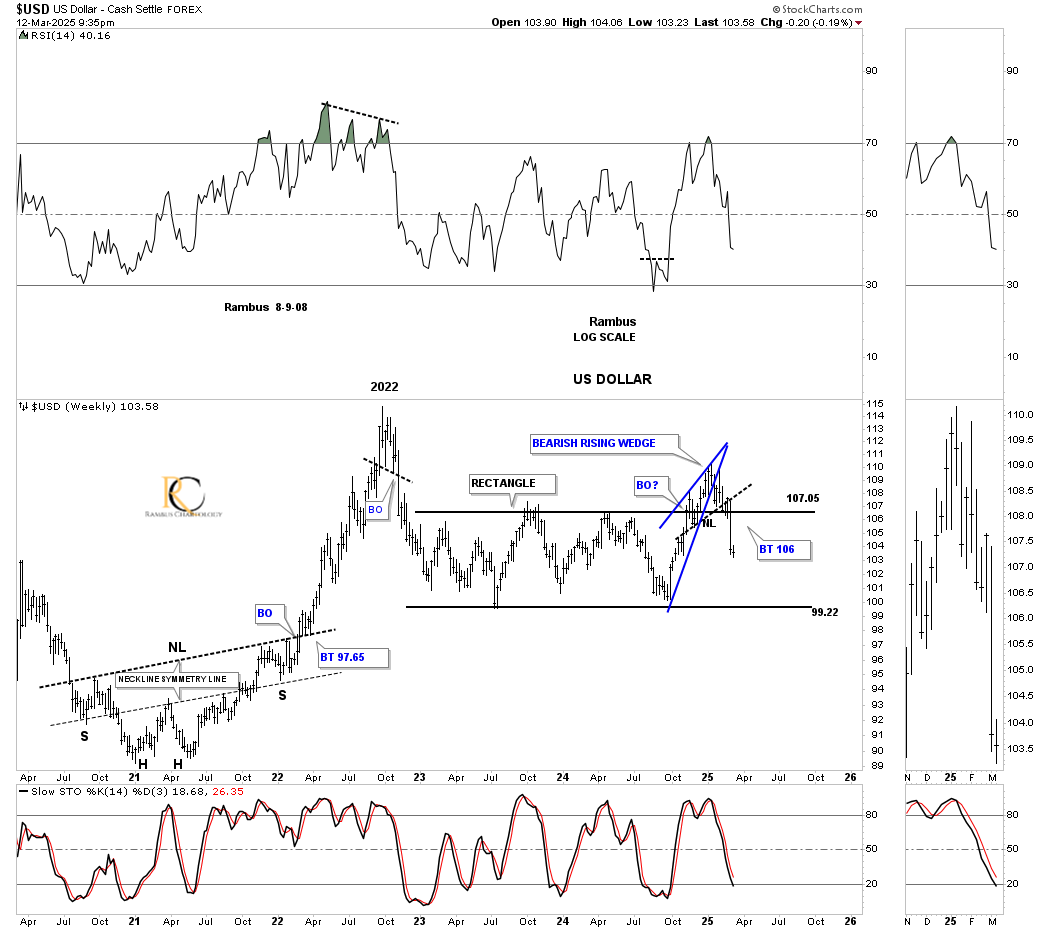
This next weekly chart for the US dollar shows the 2021 parabolic rally into the 2022 high and the decline that followed, which began the consolidation phase forming the blue rectangle. During the formation of the blue rectangle, I was of the opinion that it would break out to the downside because it was forming below the 2022 high. However, we then got what we can now label as a false breakout/bull trap above the top rail once the price action traded back inside the rectangle last week. As you can see, there is the blue bearish rising wedge we looked at on the daily combo chart above, complete with the head-and-shoulders (H&S) top. The odds have just gone up dramatically that the blue rectangle will be what I had been looking for originally – a halfway pattern to the downside – with the H&S low being the minimum price objective.
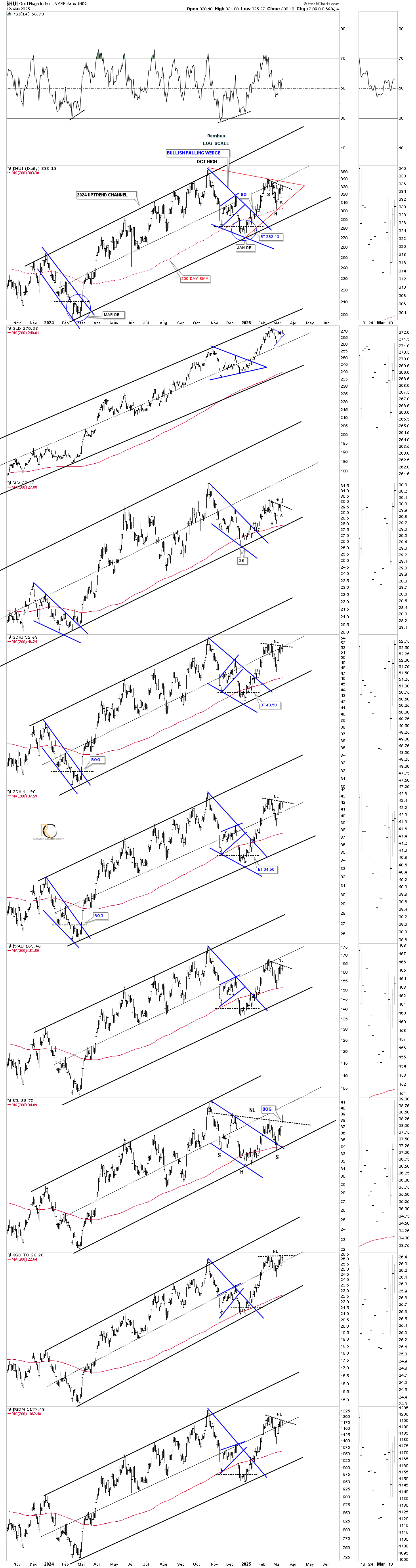
This long-term monthly combo chart compares the US dollar on top with gold in the middle and the HUI on the bottom. During the last 25 years, there have only been three major reversal points for the US dollar. The first one came in 2000, which marked a very important low for gold and the HUI. The second important reversal point came at the 2011 low for the US dollar and high for gold and the HUI.
Even though the bear market ended for gold and the HUI in 2016, the US dollar hadn’t topped out yet, which left the door open for the long, drawn-out sideways trading range. Once that parabolic rally ended in 2022 for the US dollar, you can see that both gold and the HUI formed their last reversal point in their 2011 bullish rising wedge on gold and the 2011 triangle consolidation pattern on the HUI. So, in my humble opinion (IMHO), the bull market for gold and the HUI really began at their 2022 low, at the last reversal point, which, when we look back in hindsight, will show that to be the case.
Gold is already well into its second leg up of the secular bull market that began at the 2000 low, while the HUI is getting very close to completing the breaking out and backtesting process of its 2011 triangle halfway pattern.

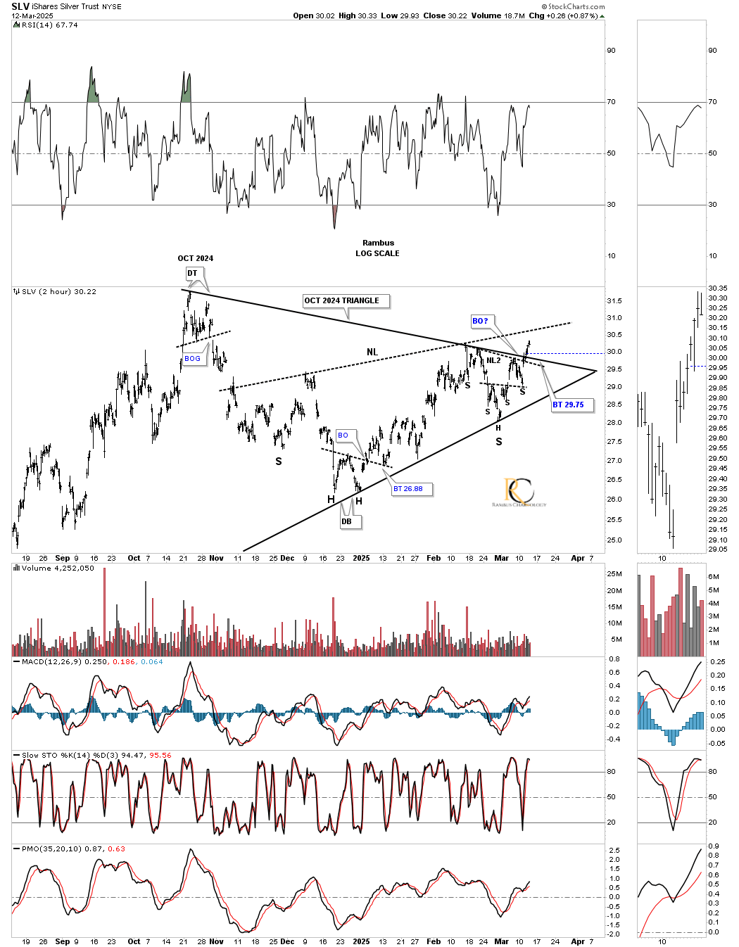
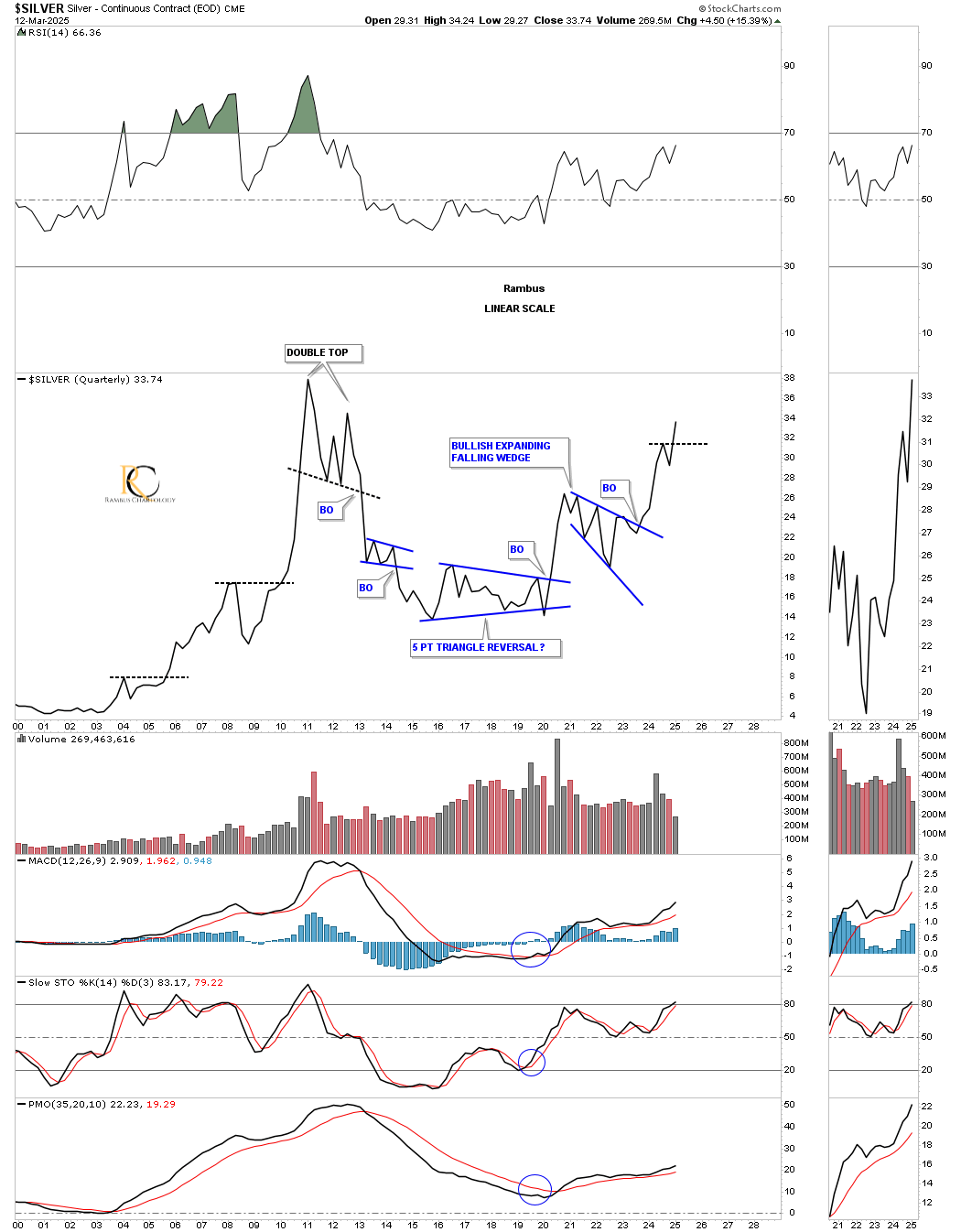
Moving on to silver, last night we looked at this 2-hour chart for SLV, which shows its October triangle with the secondary head-and-shoulders (H&S) bottom, both wrapped up into one consolidation pattern. The reason we knew the breakout was coming was because of the double H&S consolidation pattern that formed in the apex. Today, we got some nice follow-through to the upside. As I mentioned last night, the probability is still pretty high that we’ll see a backtest to the top of the triangle, which may start with a touch of the neckline.
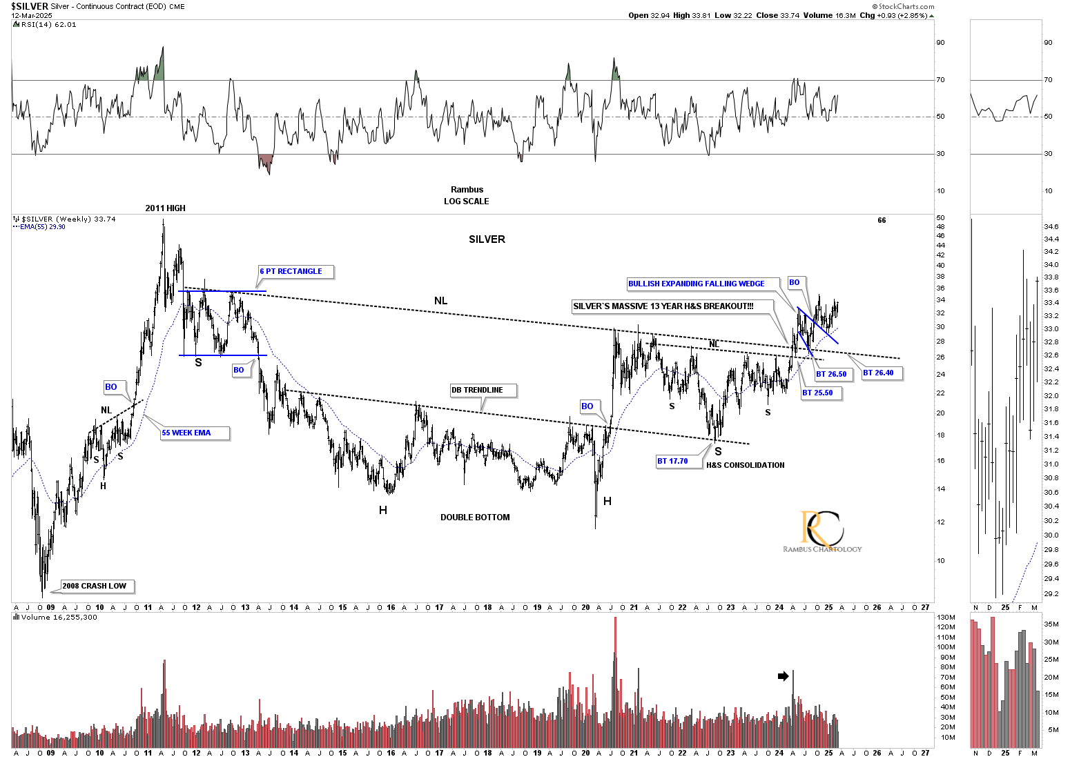
Below is the daily chart for silver, which we’ve been following literally for several years. The Chartology has worked out very well, showing us the breakout gap above the neckline and then the backtest that formed the blue bullish expanding falling wedge. Now, we have the blue triangle forming on top of the bullish falling wedge, with the price action making higher highs and higher lows. The minimum price objective for that head-and-shoulders (H&S) bottom is up around the 40 area.
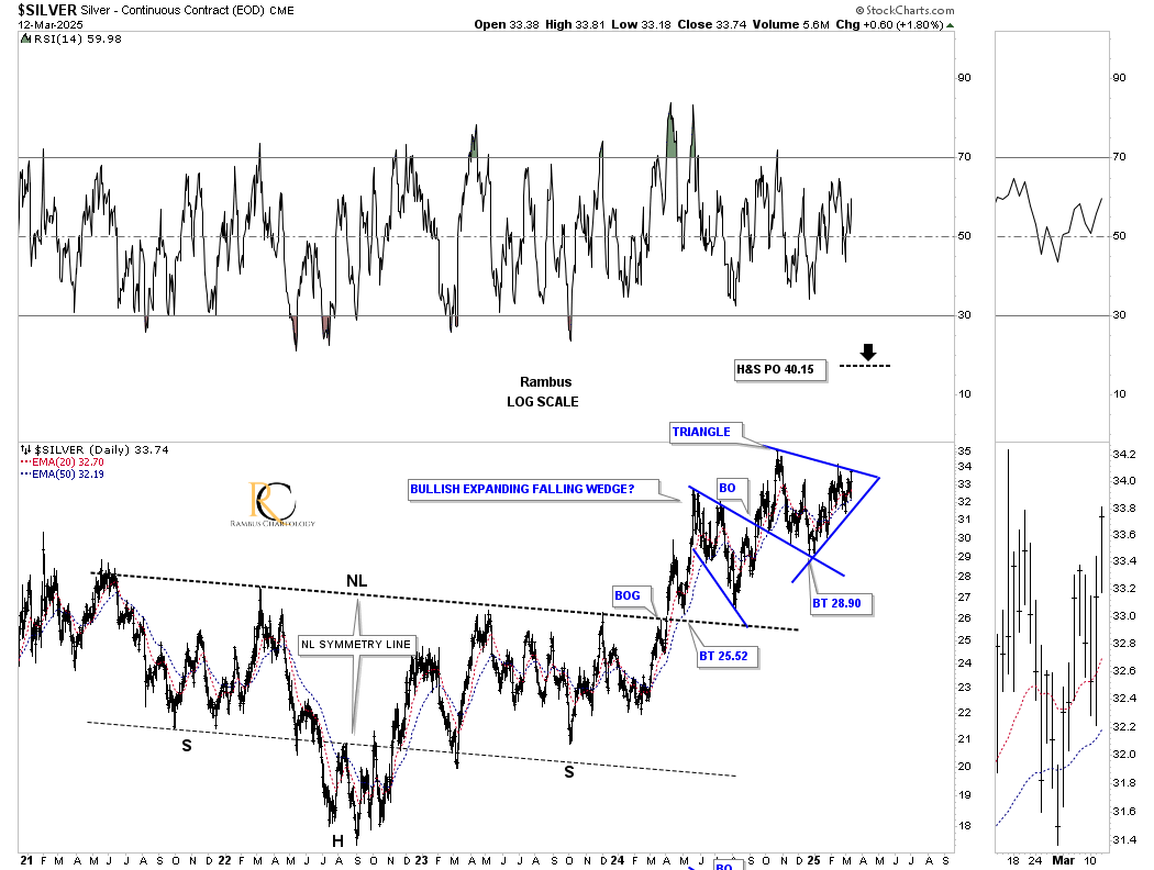
The head-and-shoulders (H&S) consolidation pattern on the daily chart above is just the right shoulder of silver’s 2011 massive H&S consolidation pattern. Note how the breakout of the smaller right shoulder neckline was backtested, and then, when the 2011 neckline was broken, it too was backtested. Now, silver is just a few points from making a new higher high. This massive 2011 H&S pattern has a minimum price objective up to the 66 area. Keep in mind that this is a minimum price objective.
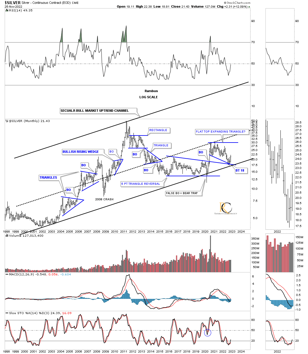
Looking at silver’s secular bull market, below is what I wrote back in November 2022:
November 25, 2022:
We looked at the secular bull market for gold and the HUI; now let’s look at the secular bull market for silver. Again, you can see how important the bottom trendline is by the number of touches it has. The bottom rail of the 2020 flat-top expanding triangle is also intersecting the bottom rail of the 2001 secular bull market uptrend channel and is finding support. Three support zones in one.
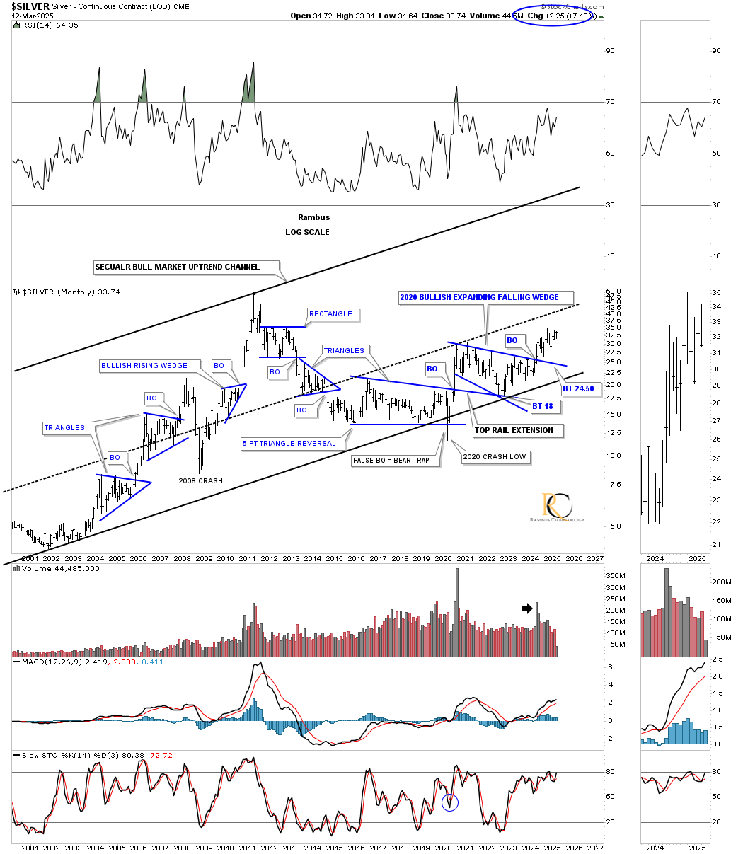
Today, March 12, 2025:
As you can see, that critical inflection point described on the chart above held support, with silver now on the verge of making a new higher high after completing its 2020 bullish expanding falling wedge.
This next chart is a quarterly bar chart that shows silver’s secular bull market, with the blue, thin rectangles on the left side of the chart indicating the height of each channel. The long black arrows measure time and price, so if the 2000 to 2011 black arrow matches the long black arrow taken from the 2020 low in time and price, then silver could reach a high sometime at the end of this decade. So far, the price action taken from the 2020 low is following the angle of the long black arrow taken from the 2000 low pretty closely.
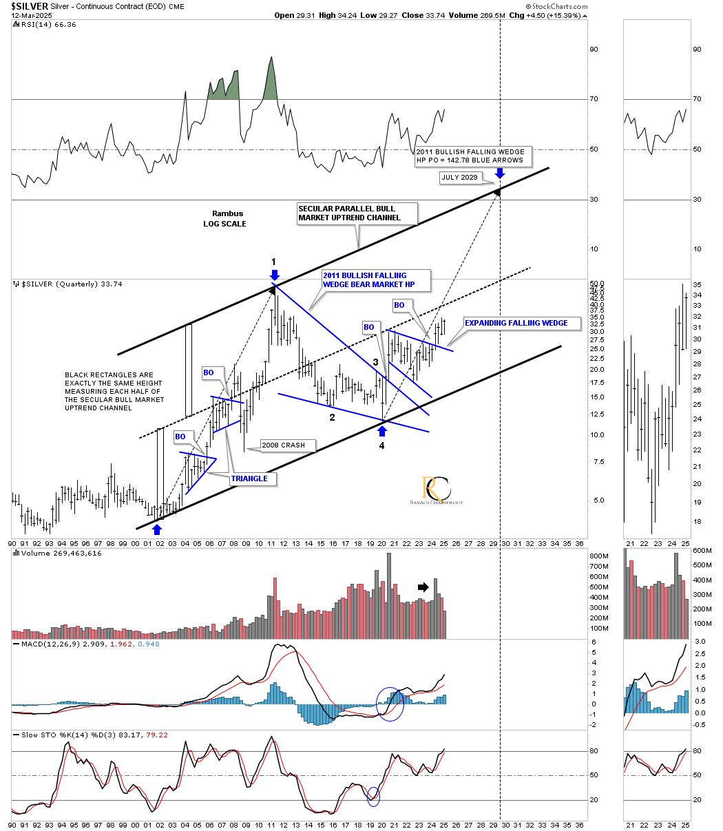
With just 2 1/2 weeks of trading left for the first quarter of 2025, silver is now trading at a higher high, which is what a bull market is supposed to look like (see the left side of the chart during the first leg up).
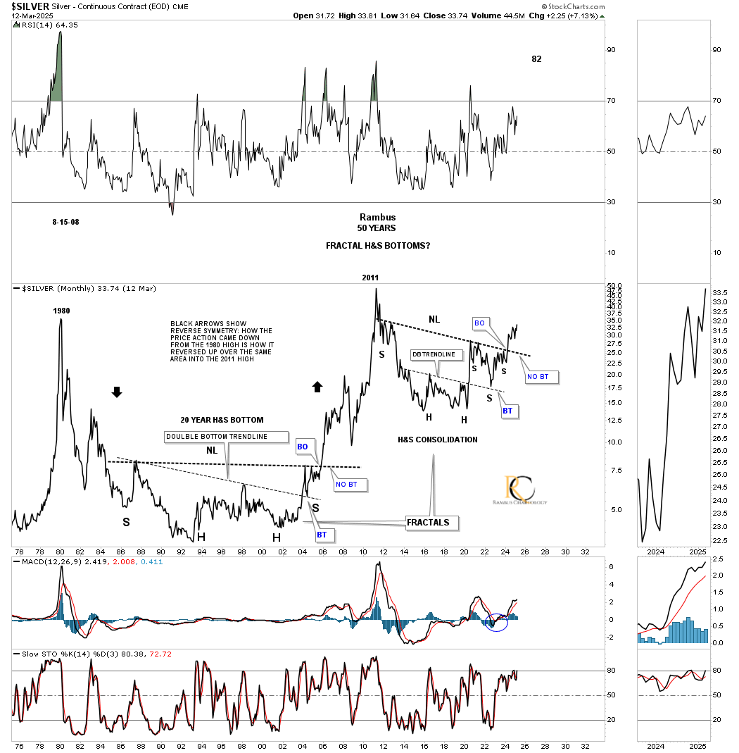
This next long-term monthly chart for silver is one of my all-time favorites, which goes all the way back to the 1980 high. After that all-time high was made, silver began the bear market from hell, which lasted over 20 years, finally bottoming in 2002/2003, several years after gold and the PM stock indexes bottomed.
Silver formed a 20-year double base reversal pattern with the double bottom and the inverse head-and-shoulders (H&S) bottom. What is fascinating about this massive base is the way the right shoulder low formed on the backtest to the double bottom trendline.
Now, we can compare the current massive 2011 H&S base to that of the previous 20-year H&S base. Note the large annotation that says, “FRACTALS.” Note how the 2011 H&S bottom also formed a double head or double bottom, with the right shoulder low again finding support on the backtest to the double bottom trendline. From this monthly line chart perspective, silver is currently trading at a new higher high for the month of March.
What the very large 2011 H&S consolidation pattern is showing us is that the bull market is really just getting started since the breakout above the neckline occurred, completing all the work. If you compare where silver is currently trading since the breakout of the 2011 H&S bottom and compare current price action relative to the breakout of the 20 year base it should be very obvious that the current setup and rally have years to move higher.
Keep in mind that all of the PM stock indexes also have a massive 2011 consolidation pattern which is strongly suggest something big is going to take place in the PM complex over the coming years.
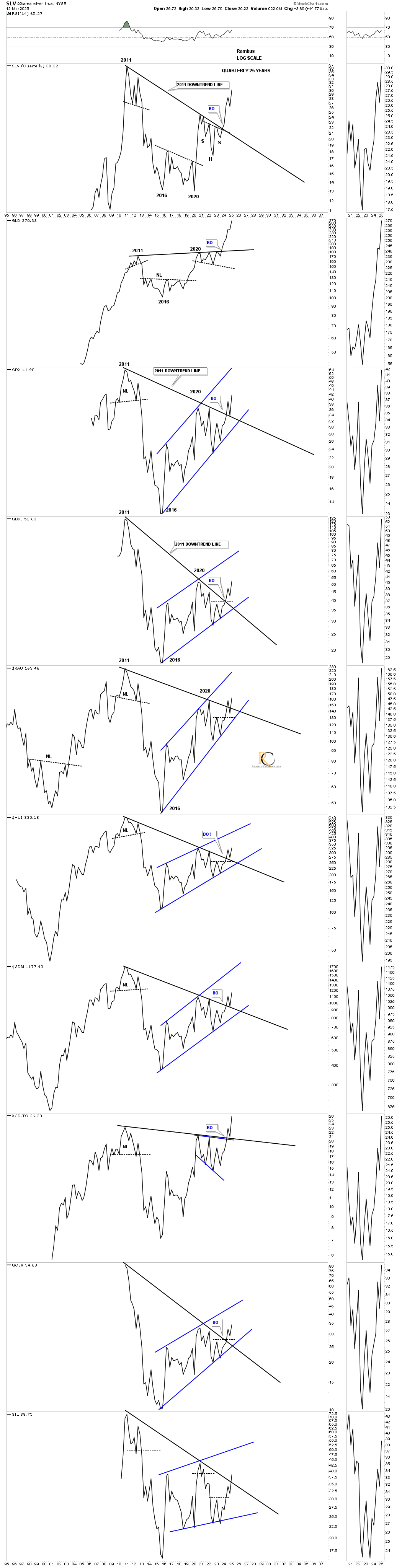
This next chart is a quarterly line combo chart that I originally built years ago, which shows the black downsloping trendline taken from the 2011 all-time high. I knew that once that 2011 downtrend line was broken to the upside, the bear market was over. Now, every index is trading above the 2011 downtrend line, with the SIL being the last one. Note how many of the indexes also backtested that trendline from above, telling us it’s hot and worthy of respect.
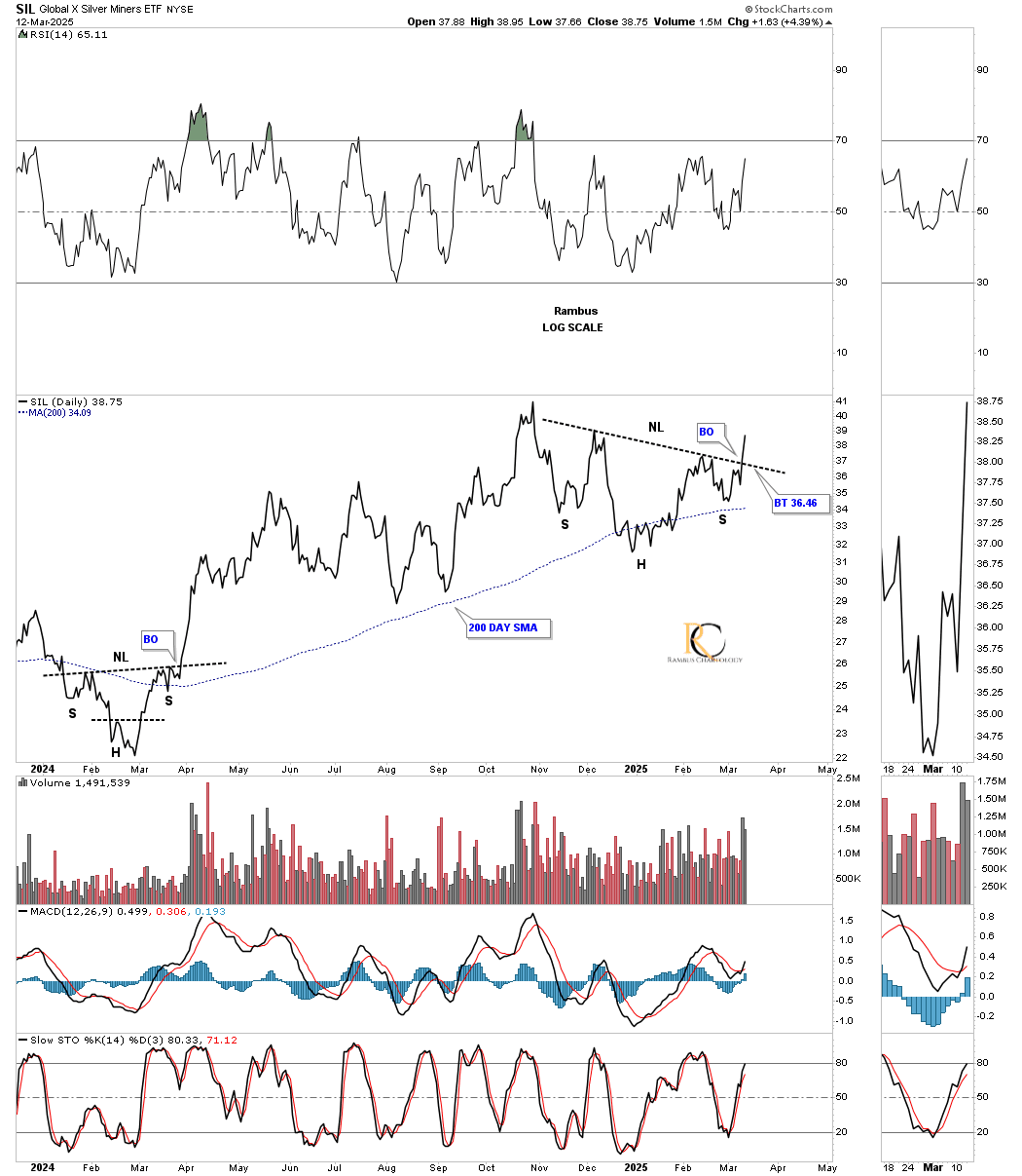
I mentioned at the beginning of this post that silver is now starting to break out to the upside, which should take the SIL and SILJ higher as well. Below is a daily line chart for SIL, which shows it breaking out from its October 2024 head-and-shoulders (H&S) consolidation pattern.
SILJ is a step behind, but is now approaching its neckline, which will be beneficial for the silver junior stocks once completed.
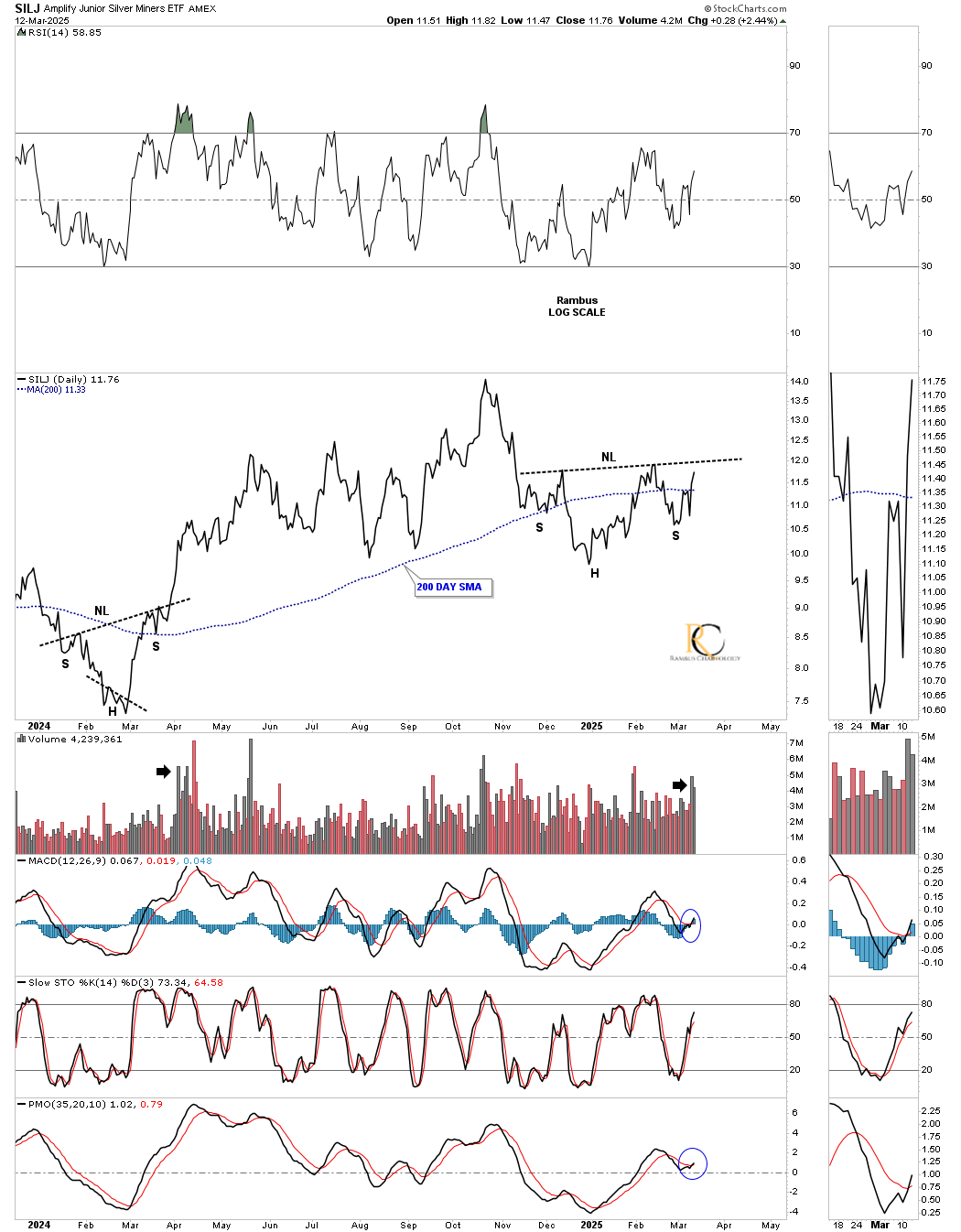
I’ve updated this daily combo chart we’ve been following to show how the small head-and-shoulders (H&S) bottoms are forming in the apex of the October 2024 triangle. I’ve used up all my annotation, so I made the 2024 triangle on the HUI red so it’s easier to see, with the small H&S bottoms forming in the apex.
GLD looks like it has just broken out of a small triangle consolidation pattern, with SLV just below the small H&S consolidation pattern. The rest are just showing the small H&S consolidation patterns.
Note the double breakout on SIL: first from the blue bull flag, and today with a breakout gap above its neckline.
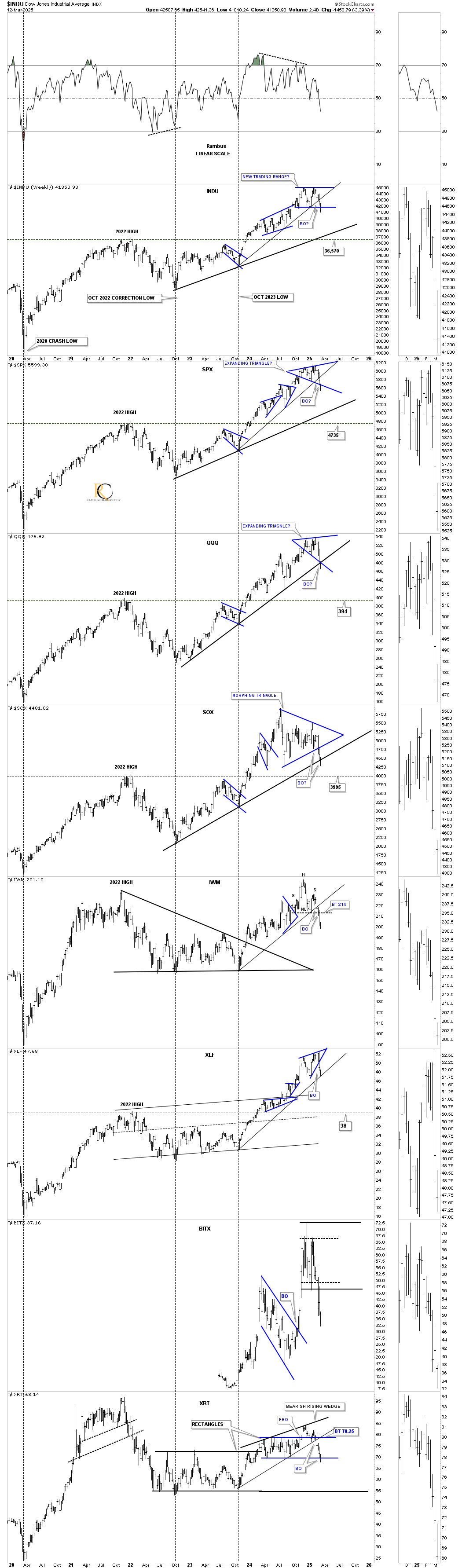
Moving on to the US stock markets, below is the 2-hour chart for the INDU, which is now confirming that a double top is in place with the breakdown below the double top trendline yesterday. What I’m looking for right now is either a continuation move to the downside to reach the previous low, where I show a possible neckline, or we could see a bounce at any time to the double top trendline, which now becomes my line in the sand.
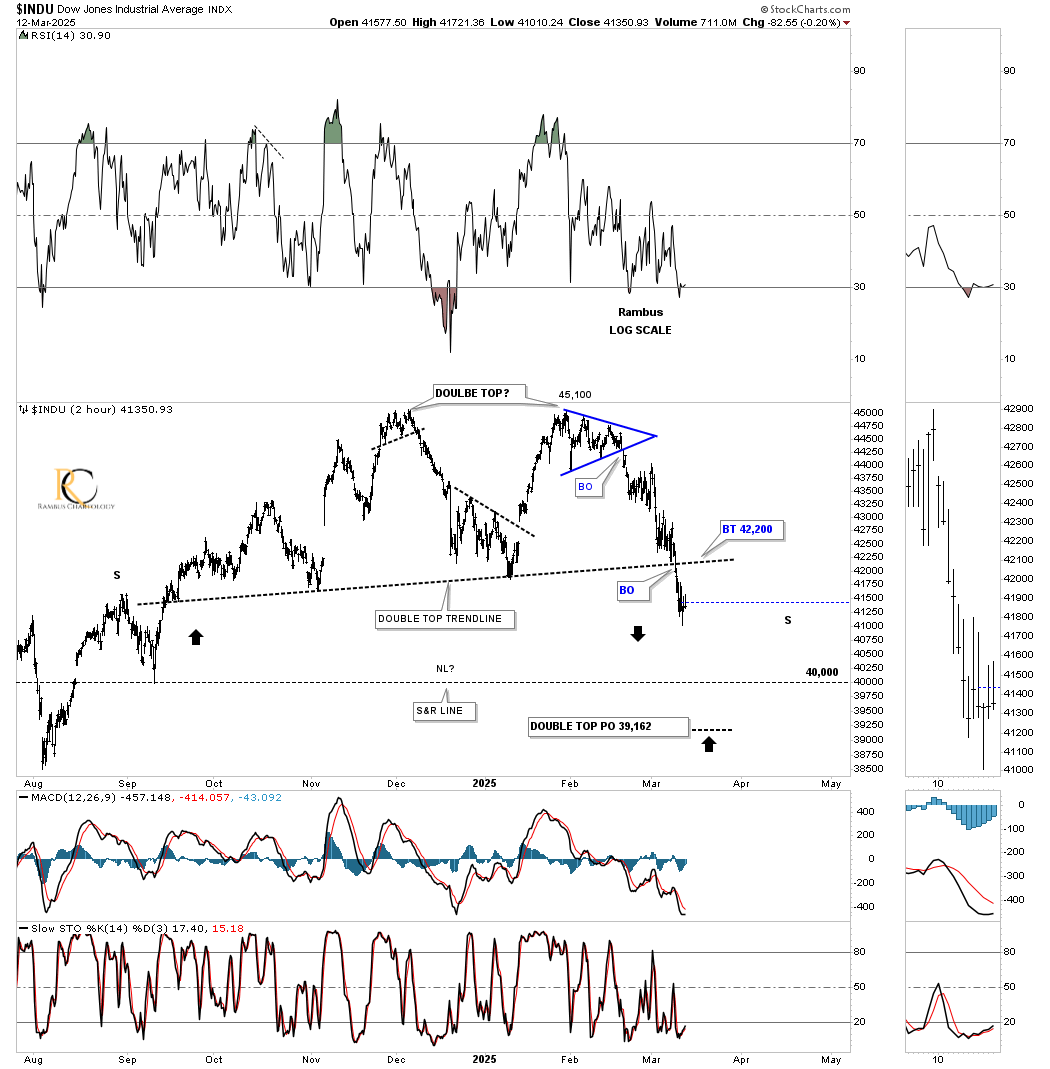
This last chart for tonight is the weekly combo chart we’ve been following pretty closely, showing the October 2023 thin uptrend line and the thicker 2022 uptrend line. Most of the thin October trend lines have now been broken, with a few of the thick black trend lines also getting seriously tested. For the time being, it’s time to just observe the price action and see what develops.
I’ve been slow to come around to the fact that the PM complex could be in a 2000-2003 outperformance of the stock markets, which was 25 years ago. The PM complex is showing relative strength to the stock markets right now, which is very encouraging. Stay tuned, as things are really starting to heat up, especially in the PM complex. All the best…Rambus